Minco2 beta 2 released
I have just released our second beta version with major UI changes.
If you are interested to get notified when the final version is released register on our Minco 2 page.
I can not tell you how many times I have reconsidered the design of the UI in the last 3 years. The most of the screenshots below are taken from already
working apps.
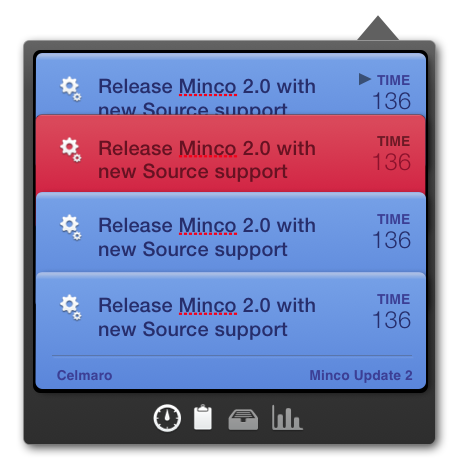
07/2014 beta 2:
The winner. A mix of the last two matching with the new OS X style of Yosemite. Since it turned out that the previous UI was too difficult to use we decided to bring the mode switch button back in the UI.

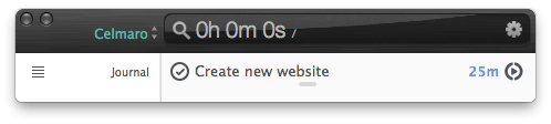
06/2014 beta 1:
Without the slide animation but with a fade out of the counter display to make the search field visible. It turned out that the missing display mode button make it too difficult to use.
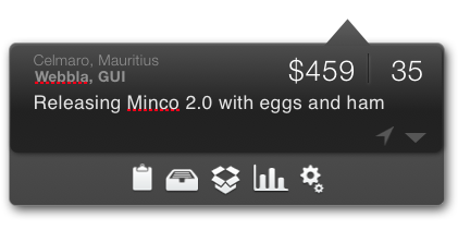
04/2013:
The first design I was really happy and on the way to be released. It was inspired by the iOS App I completed before with the functionality to slide the counter display on the left to start and stop counting.

08/2012:
When Apple introduced Passbook I was impressed from the design. It was also planned to use this design for the companion iOS App.
02/2012:
A second concept but influenced from the Twitter client for iOS.

late/2011:
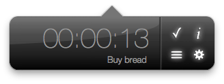
This was one of the first ideas for Minco 2. It was some similar to Minco 1 with additional features like work-time history, chart, and a search field only visible in the addition mode.
09/2009:
Minco 1 initial design. I have started with Minco 1 in 2009 and it was a new lightweight time tracking experience at this time.